


, 3-Port Fast Compact Wall Charger for MacBook Pro/Air, Google Pixelbook, ThinkPad, Dell XPS, iPad Pro, Galaxy S22/S20, iPhone 13/Pro, and More")


This example demonstrates how to get the Custom circle button in android.
Method 1: Use XML drawable like this:
Save the following contents as round_button.xml in drawable folder.
Note: you just need to save it to the ‘drawable’ folder, any XML resource for drawable is typically saved in ‘drawable’, not in mdpi, hdpi, etc.
<?xml version="1.0" encoding="utf-8"?>
<selector xmlns:android="http://schemas.android.com/apk/res/android">
    <item android:state_pressed="false">
        <shape android:shape="oval">
            <solid android:color="#fa09ad"/>
        </shape>
    </item>
    <item android:state_pressed="true">
        <shape android:shape="oval">
            <solid android:color="#c20586"/>
        </shape>
    </item>
</selector>
Android Material Effect: Although FloatingActionButton is a better option, If you want to do it using XML selector, create a folder drawable-v21 in res and save another round_button.xml there with the following XML
<?xml version="1.0" encoding="utf-8"?>
<ripple xmlns:android="http://schemas.android.com/apk/res/android"
    android:color="#c20586">
    <item>
        <shape android:shape="oval">
            <solid android:color="#fa09ad"/>
        </shape>
    </item>
</ripple>
And set it as the background of Button in XML like this:
<Button
android:layout_width="50dp"
android:layout_height="50dp"
android:background="@drawable/round_button"
android:gravity="center_vertical|center_horizontal"
android:text="hello"
android:textColor="#fff" />
Important:
- If you want it to show all these states (enabled, disabled, highlighted, etc), you will use the selector as described here.
- You’ve to keep both files in order to make the drawable backward-compatible. Otherwise, you’ll face weird exceptions in the previous android version.
See more:
1.
Method 2: Use VectorDrawable and ConstraintLayout
<FrameLayout
            android:id="@+id/ok_button"
            android:layout_width="100dp"
            android:layout_height="100dp"
            android:foreground="?attr/selectableItemBackgroundBorderless"
            android:background="@drawable/circle_button">
                <android.support.constraint.ConstraintLayout
                    android:layout_width="match_parent"
                    android:layout_height="match_parent">
                    <ImageView
                        android:id="@+id/icon_of_button"
                        android:layout_width="32dp"
                        android:layout_height="32dp"
                        app:layout_constraintBottom_toBottomOf="parent"
                        app:layout_constraintTop_toTopOf="parent"
                        app:layout_constraintRight_toRightOf="parent"
                        app:layout_constraintLeft_toLeftOf="parent"
                        app:srcCompat="@drawable/ic_thumbs_up"/>
                    <TextView
                        android:id="@+id/text_of_button"
                        android:layout_width="wrap_content"
                        android:layout_height="wrap_content"
                        app:layout_constraintTop_toBottomOf="@+id/icon_of_button"
                        app:layout_constraintRight_toRightOf="parent"
                        app:layout_constraintLeft_toLeftOf="parent"
                        android:layout_marginTop="5dp"
                        android:textColor="@android:color/white"
                        android:text="ok"
                        />
                </android.support.constraint.ConstraintLayout>
            </FrameLayout>
circle background: circle_button.xml
<?xml version="1.0" encoding="utf-8"?>
<shape xmlns:android="http://schemas.android.com/apk/res/android"
android:shape="rectangle">
<corners android:radius="1000dp" />
<solid android:color="#41ba7a" />
<stroke
    android:width="2dip"
    android:color="#03ae3c" />
<padding
    android:bottom="4dp"
    android:left="4dp"
    android:right="4dp"
    android:top="4dp" />
</shape>
Method 3: Using Vactor Asset
Create a new vector asset in the drawable folder.
You can import your PNG image as well, and convert the file to SVG online at https://image.online-convert.com/convert-to-svg. The higher the resolution, the better the conversion will be.
Next, create a new vector asset from that SVG file.
This is a sample vector circle image you can use. Copy the code to an XML file in the drawables folder.
ic_check.xml:
<vector xmlns:android="http://schemas.android.com/apk/res/android"
    android:width="24dp"
    android:height="24dp"
    android:viewportHeight="256"
    android:viewportWidth="256">
    <path
        android:fillColor="#2962FF"
        android:pathData="M111,1.7c-7.2,1.1 -22.2,4.8 -27.9,7 -33.2,12.5 -61.3,40.3 -74.1,73.3 -8.7,22.6 -10.5,55.3 -4.4,78 10.9,40 39.7,72.4 77.4,87 22.6,8.7 55.3,10.5 78,4.4 45.3,-12.3 79.1,-46.1 91.4,-91.4 2.9,-10.7 3.9,-21.9 3.3,-37.4 -0.7,-21.2 -4.6,-35.9 -14,-54.1 -18.2,-35 -54,-60.5 -93.4,-66.4 -6.7,-1 -30.7,-1.3 -36.3,-0.4zM145,23.1c21.8,3.3 46.5,16.5 61.1,32.8 20.4,22.6 30.1,51.2 27.7,81.1 -3.5,44.4 -35.9,82.7 -79.6,94 -21.6,5.6 -46.6,3.7 -67.8,-5.1 -10.4,-4.3 -24.7,-14.1 -33.4,-22.9 -41.6,-41.5 -41.6,-108.4 0,-150 24.3,-24.3 57.6,-35.1 92,-29.9z"
        android:strokeColor="#00000000" />
    <path
        android:fillColor="#2962FF"
        android:pathData="M148.4,113c-24.6,26 -43.3,44.9 -44,44.6 -0.7,-0.3 -8.5,-6.1 -17.3,-13 -8.9,-6.9 -16.5,-12.6 -17,-12.6 -1.4,-0 -25.6,19 -25.8,20.3 -0.3,1.4 62.7,50.2 64.8,50.2 1.7,-0 108.4,-112.3 108.4,-114.1 0,-1.3 -23.8,-20.4 -25.4,-20.4 -0.6,-0 -20.2,20.3 -43.7,45z"
        android:strokeColor="#00000000" />
</vector>
Use this image in your button:
<ImageButton
    android:id="@+id/btn_level1"
    android:layout_width="36dp"
    android:layout_height="36dp"
    android:background="@drawable/ic_check"
/>
Your button will be a circle button.

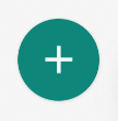
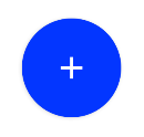
Method 4: Using Material Components library Official Library
With the official Material Components library, you can use the MaterialButton applying a Widget.MaterialComponents.Button.Icon style.
Something like:
   <com.google.android.material.button.MaterialButton
            android:layout_width="48dp"
            android:layout_height="48dp"
            style="@style/Widget.MaterialComponents.Button.Icon"
            app:icon="@drawable/ic_add"
            app:iconSize="24dp"
            app:iconPadding="0dp"
            android:insetLeft="0dp"
            android:insetTop="0dp"
            android:insetRight="0dp"
            android:insetBottom="0dp"
            app:shapeAppearanceOverlay="@style/ShapeAppearanceOverlay.MyApp.Button.Rounded"
            />
Currently the app:iconPadding="0dp",android:insetLeft,android:insetTop,android:insetRight,android:insetBottom attributes are needed to center the icon on the button avoiding extra padding space.
Use the app:shapeAppearanceOverlay attribute to get rounded corners. In this case, you will have a circle.
  <style name="ShapeAppearanceOverlay.MyApp.Button.Rounded" parent="">
    <item name="cornerFamily">rounded</item>
    <item name="cornerSize">50%</item>
  </style>
The final result:
 With jetpack compose you can use:
    Button(
        onClick = { /* Do something! */ },
        modifier = Modifier.width(48.dp).height(48.dp),
        shape = CircleShape
    ) {
        Icon(Icons.Filled.Add, "")
    }
If you have any questions, feel free to ask in the comments below. I try my best to respond to every comment that comes my way. If for any reason you don’t get a response, feel free to ask me on Twitter, or Facebook. If you want to follow me on those social media links as well to see different pictures and just talk about different things going on in the tech world.


